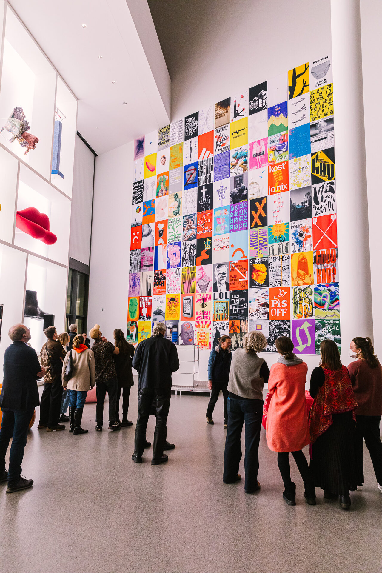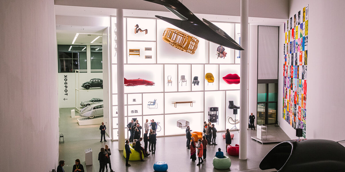
In the "100 Poster Battle" seminar, students at Dortmund University of Applied Sciences and Arts work as if they were in a newsroom - with the difference that instead of news, they create snappy, visually stunning posters. Most recently, 108 of them were on display at the renowned Pinakothek der Moderne in Munich. Two students present ten of the posters and explain why they are worth exhibiting.
A good poster, explains Prof. Lars Harmsen, meets several criteria: The topic is recognizable. It is original. And it triggers an internal discourse.
Prof. Lars Harmsen about a good posterWhen you look at it, the scissors in your head should open.
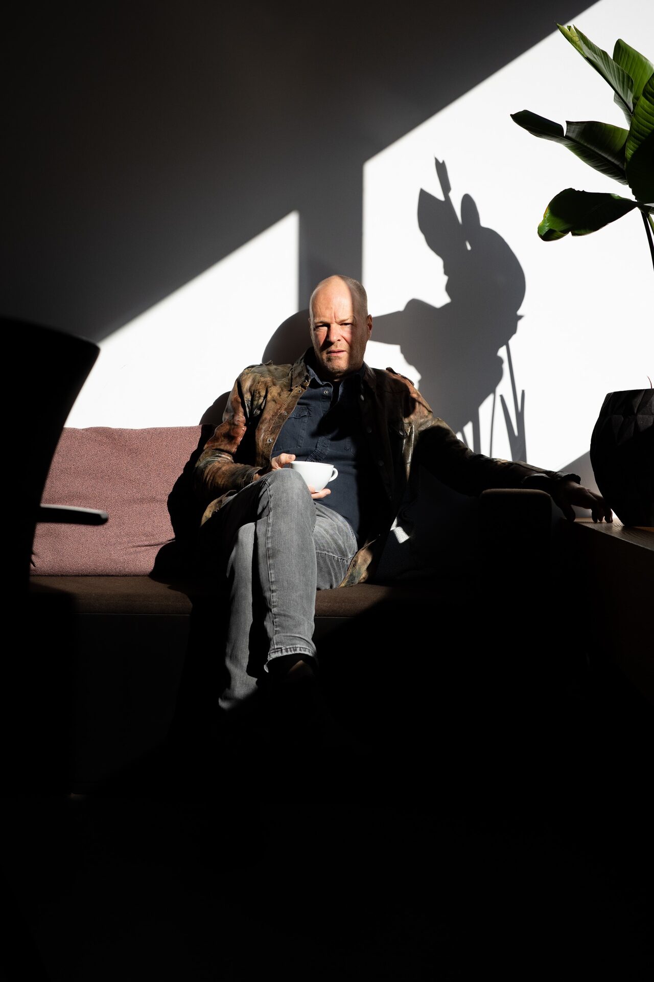
Prof. Lars Harmsen came up with the "100 Poster Battle" format and has already implemented it several times with students at the Faculty of Design at Fachhochschule Dortmund. The 108 posters in the Pinakothek come from these sessions.
Posters on current news
In two of these, 50 students from Fachhochschule Dortmund came together with twelve students from the German University in Cairo via Webex. The students had previously selected ten motifs each: Photos, graphics, background images, symbols, lettering, logos.
This database served as a pool of motifs for the poster design. The themes were "Love and Peace" and "Tourism". "The students discussed what these topics mean in Germany and in Egypt," says Prof. Harmsen. "An exciting exchange."
The other sessions were part of the seminar. Every week, the students designed posters on the latest news: Checking the news situation, discovering the topic, finding and implementing their own approach, always in the course of a day, just like in a newsroom.
Lars Harmsen set an additional technical task each week, for example, the students had to use only typography or only software that is not actually intended for designing, such as Excel or gaming programs.
Posters from the previous "100 Poster Battles" have already adorned the back wall of the Faculty of Design stand at the Frankfurt Book Fair several times. "We are also in talks with various design festivals," says Lars Harmsen. "I would love to exhibit at the European Design Festival in Chaumont, that would be wonderful."
A cooperation with the uzwei exhibition floor in Dortmund's U-Tower is also a heartfelt wish. Especially if the students there were to offer poster workshops for children. The latest show can certainly help with applications.
Prof. Lars HarmsenThe fact that we were able to exhibit in Munich is of course sensational.
In total, the current poster pool of the seminar series amounts to around a thousand designs. Students Jule Orlik and Tim Stange were involved in selecting the 108 posters for the Pinakothek.
Here they present ten of the posters and explain their own view of the designs. Incidentally, the titles of the posters were not created by the designers, but were formulated by the curators for the exhibition.
1. "Moneymaker" by Sophia Klimaszewski
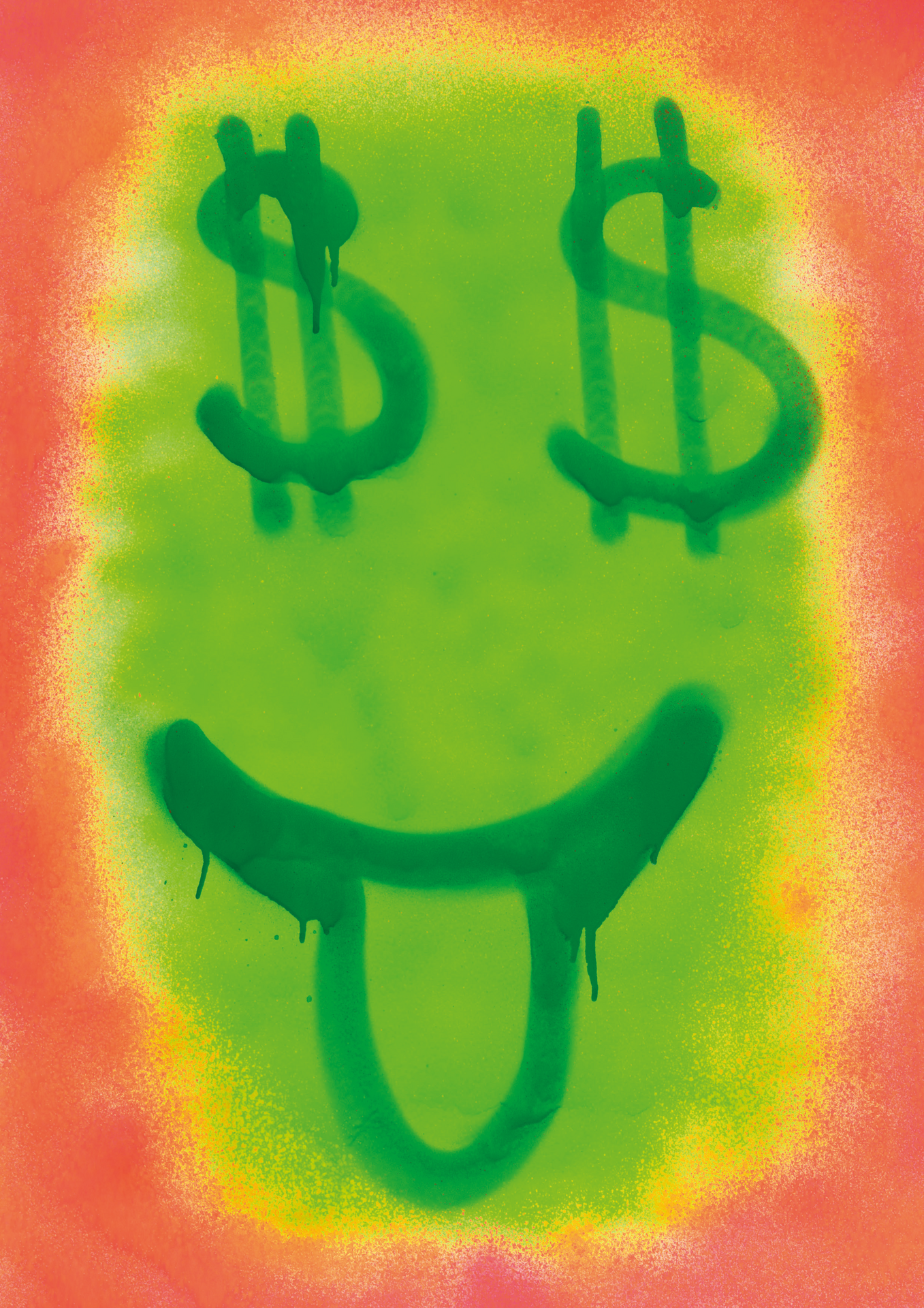
Thematic brief: Gentrification, i.e. the displacement of poorer people from individual neighborhoods by wealthier people
Jule Orlik and Tim Stange:
The poster was created during an excursion in Lisbon, in an open workshop situation with many students working simultaneously and exchanging and inspiring each other. In Lisbon, the clash of social contrasts is particularly present, many districts are undergoing change, inhabited and vacant houses are close together, gentrification is noticeable everywhere.
Sophia did not design the poster digitally, but sprayed it completely analog with spray cans. In doing so, she takes up the classic urban protest form of graffiti and uses a few lines to satirically paint the greedy and ruthless grimace of real estate speculators and rent sharks on the wall.
2. "Vacation" by Tim von Bischopinck
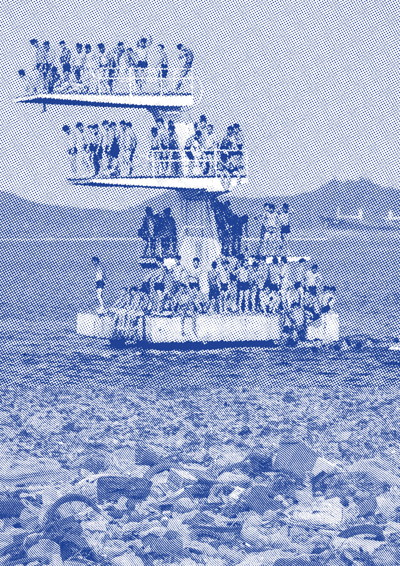

Thematic brief: Tourism
Jule Orlik and Tim Stange:
The diving platform is an element of a typical leisure and vacation activity that is as popular as it is banal, and here it is also hopelessly over-frequented - and thus an indication of soulless mass tourism.
At second glance, the supposed water turns out to be an area covered in garbage, which can be read as an allusion to the harmful effects of mass tourism.
The coarse grid changes from dots in the upper part to wavy lines in the lower part, the colors are reduced to violet and light grey. Both allude to package vacations as a monotonous, eternally repetitive experience.
3. "Love" by David Reske
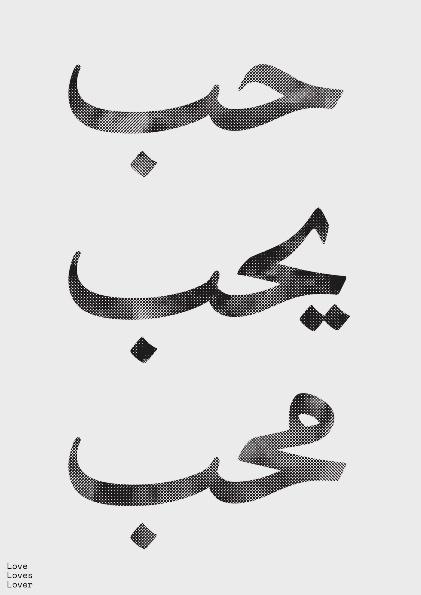
Thematic brief: Love and Peace
Jule Orlik and Tim Stange:
"Love" was created during a remix session with students from Cairo. We created a pool of motifs for which each of us students selected around ten images or parts of images. In the remix sessions, we designed our posters exclusively with motifs from this pool.
David's minimalist design celebrates the beauty of Arabic characters and uses them to promote the idea of love. This is a good example of how posters don't always have to convey a complex message. Sometimes a simple, clear and, in this case, beautiful thought is enough.
4. "Free Baby Pill" by Muriel Labadi

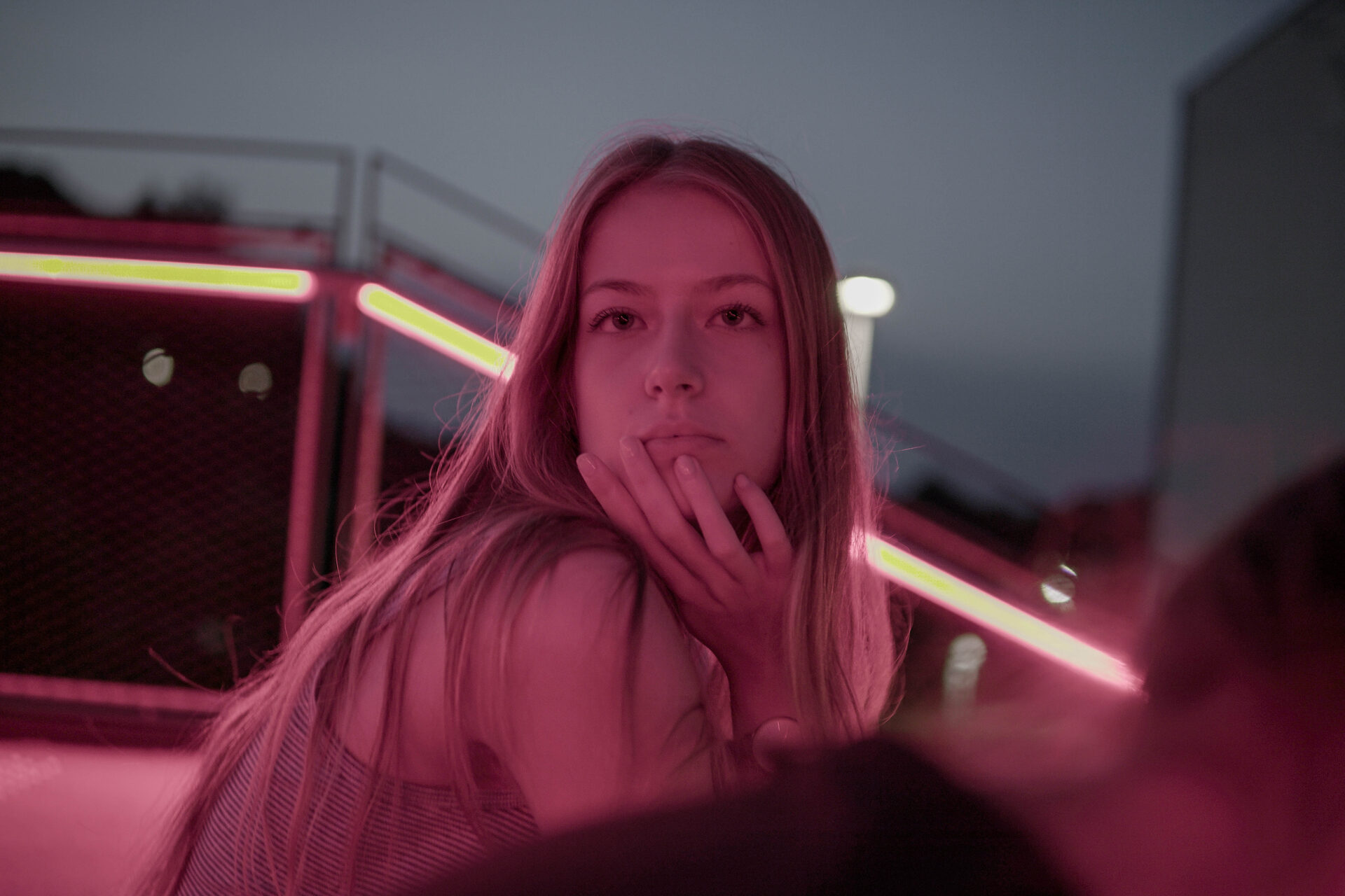
Technical specification: No Adobe ("No Adobe")
Jule Orlik and Tim Stange:
Adobe programs such as Photoshop, Illustrator and InDesign are the classic tools of the trade for designers. Lars Harmsen's suggestion that we do without them was an opportunity for us to break our habits and try something different.
Muriel's design is a very reduced detail of a person with a veiled face, militant look and raised arm, an iconic representation of protest and so strong that it manages without any text at all.
The opaque colors in a harsh yellow-red contrast further heighten the drama. The title is appropriately formulated like a battle cry and alludes to the fact that the poster was created in the wake of the controversies surrounding abortion and the contraceptive pill in the USA, for example.
5 "Climate Protests" by Franziska Filmer
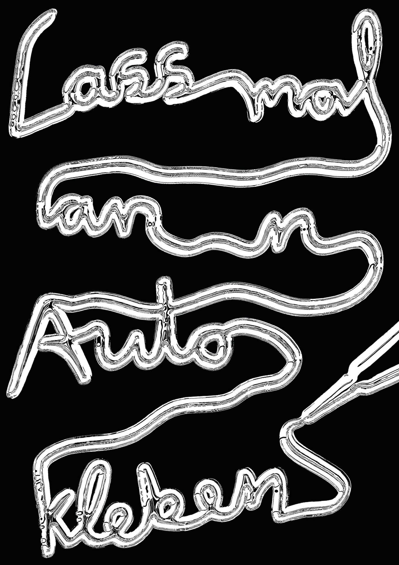

Technical specification: Only Type ("only font")
Jule Orlik and Tim Stange:
The discussion about the meaningfulness and proportionality of the Last Generation's climate protests was, for the most part, harsh and irreconcilable. Franziska takes up these clear fronts with the maximum contrast of black and white.
Again in contrast, the very colloquial wording and the design of the line of writing as a trail of glue is dripping with irony and ambiguity. It looks like Franziska deliberately wanted to keep the statement open. Perhaps as an alternative to the bony either/or structure of political discussion and as a reminder of the constructive fruitfulness of doubt.
6. "Tourism" by Aysel Kopuz
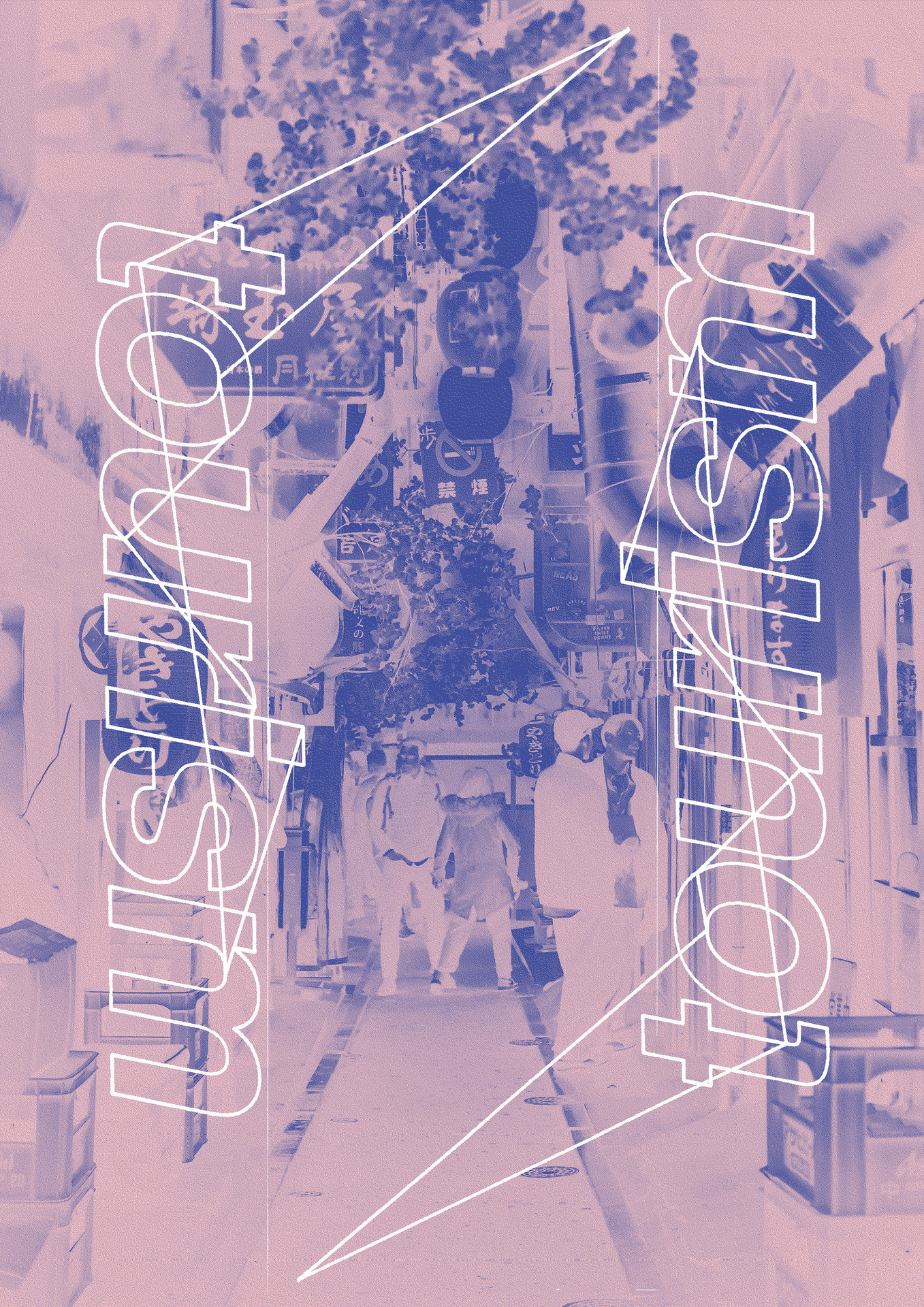
Thematic brief: Tourism
Jule Orlik and Tim Stange:
After the reduced designs, Aysel's design shows a different approach: The composition is overloaded and it takes a moment to decipher it. The motif itself also appears overloaded with the countless signs and branches hanging down and into the narrow alley from above and covering each other up.
The additional lines of the mirrored word "tourism" suggest a complex spatial structure that remains just as incomprehensible as the characters on the signs. Tourism appears here as an empty promise, as a brief, incomprehensible glimpse into a world that will always remain foreign.
7. "No Sight" by Fabian Meyer

Thematic brief: Tourism
Jule Orlik and Tim Stange:
Sometimes you need a little distance to see things more clearly. With his poster, Fabian literally takes a big step back, so far that the whole earth can be seen from afar. The planet only covers the innermost center of the image area, which otherwise remains completely empty, except for the small blue lettering at the bottom.
The entire design is reduced to the core idea, which emerges here as intensely as a surprising whisper in absolute silence: the earth is not a sight.
8. "Good/Bad 2", joint work by several students
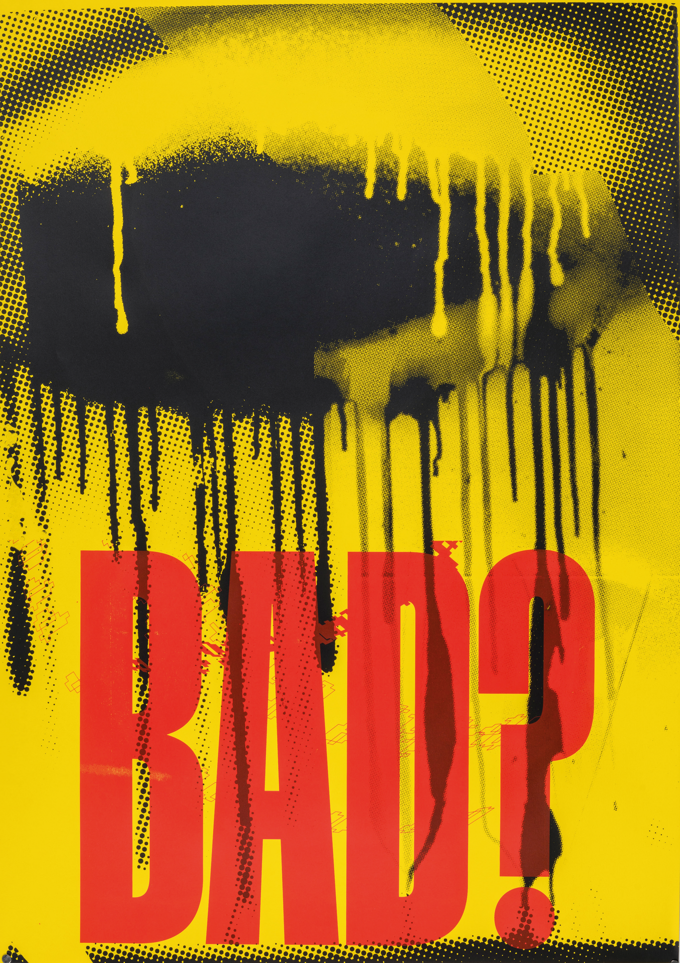
Thematic brief: Gentrification
Jule Orlik and Tim Stange:
One of the loudest works in this selection. Super-hard black-yellow-red. The gradient colors, the ruthlessly applied lettering and the deliberate breaks in the grids and contours are quotes from the urban space with its graffiti and overlapping wall markings.
The monosyllabic question "Bad?", in which the question of its opposite "Good?" resonates, may be meant as a questioning of the usual criminalization of paintings on other people's walls.
9. "No Regrets" by Selva Duyuran
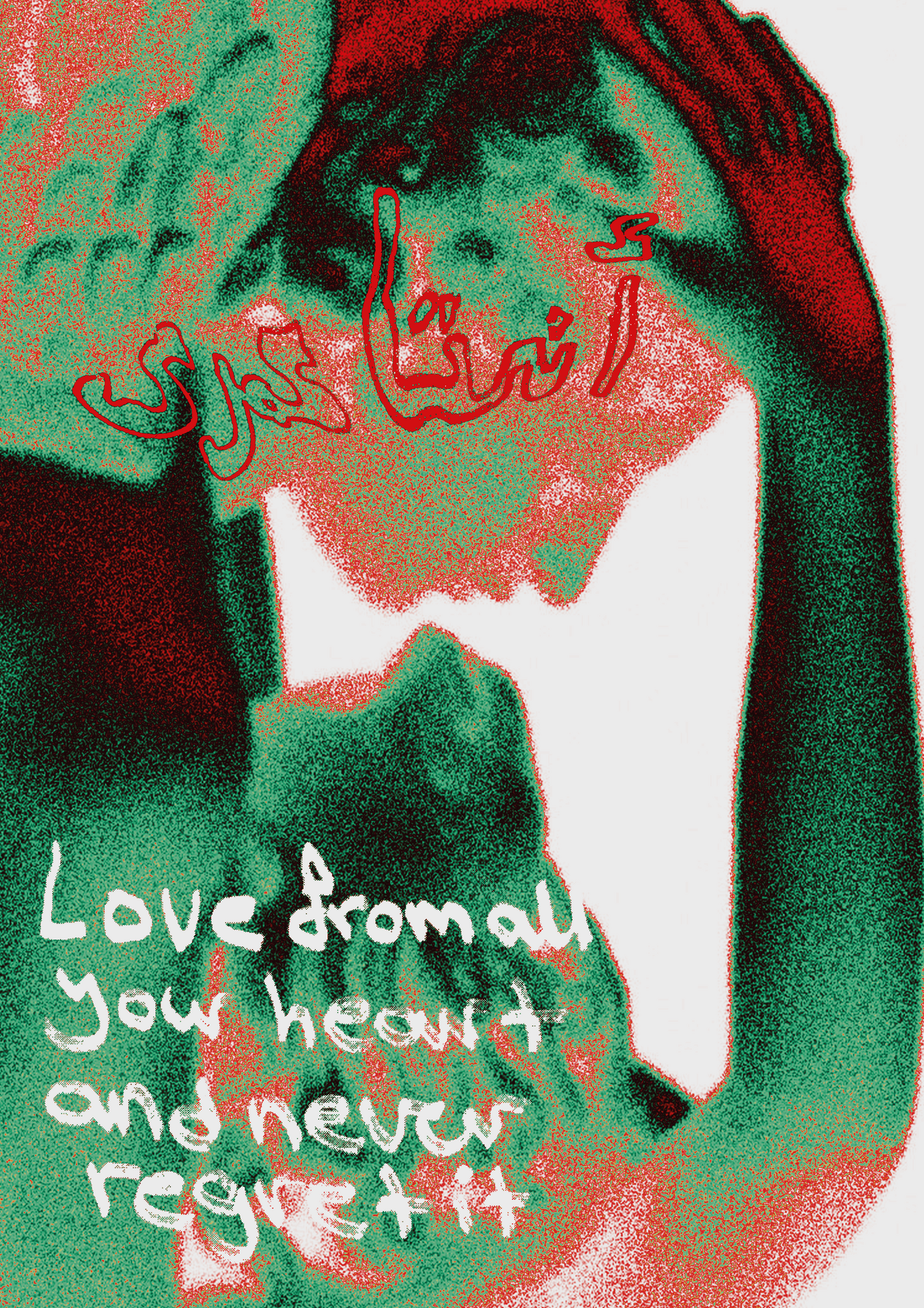
Thematic brief: Love and Peace
Jule Orlik and Tim Stange:
Selva's design, much like David Reske's poster, can be read as a clear statement of devotion to love. The arrangement of the figures is unusual, but not arbitrary, as the composition elegantly framed by the arm of the lower figure suggests.
The bodies look like classical statues, the shoulder at the top left like the wing of a Renaissance turkey, while the colors and the coarse grain are contemporary and experimental. The white English text is juxtaposed with red-bordered characters from another language. This all underlines the encouragement to follow the heart - across all differences.
10. "Police Operation" by Salma Parra
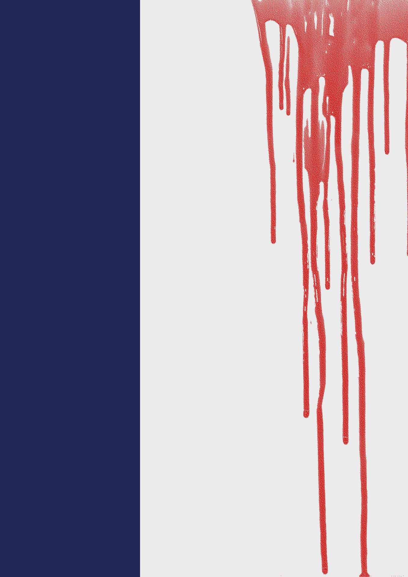
Specification: none. "Everything goes"
Jule Orlik and Tim Stange:
Next to a vertical blue bar on a white background, bright red blood trickles down the right-hand side. The news context is the accusations of racist violence against the police in France. No more words are needed. Harsh, visually powerful criticism of police violence in France.
Prof. Lars Harmsen is offering the "100 Poster Battle" seminar again in the summer semester 2024.